The WarnerMedia Brand Identity Redesign
WarnerMedia underwent a significant rebranding effort in late 2019 to modernize its visual identity. The redesign aimed to reflect the company's values and position in the entertainment industry. Changes included a new logo, typography, and color scheme that conveyed creativity, innovation, and inclusivity. The logo featured a bold, flowing design combining the "W" and "M" letters. The color palette included vibrant blue and deep purple, balancing contemporary and timeless aesthetics. This redesign marked WarnerMedia's adaptation to the evolving entertainment landscape and positioned the company for future success.


THE DELIVERABLES
The deliverables from the redesign represented a comprehensive & cohesive visual system that reflected the company's evolution & aspirations for its future growth & development. WarnerMedia's brand identity included a range of visual & strategic elements:
Brand strategy
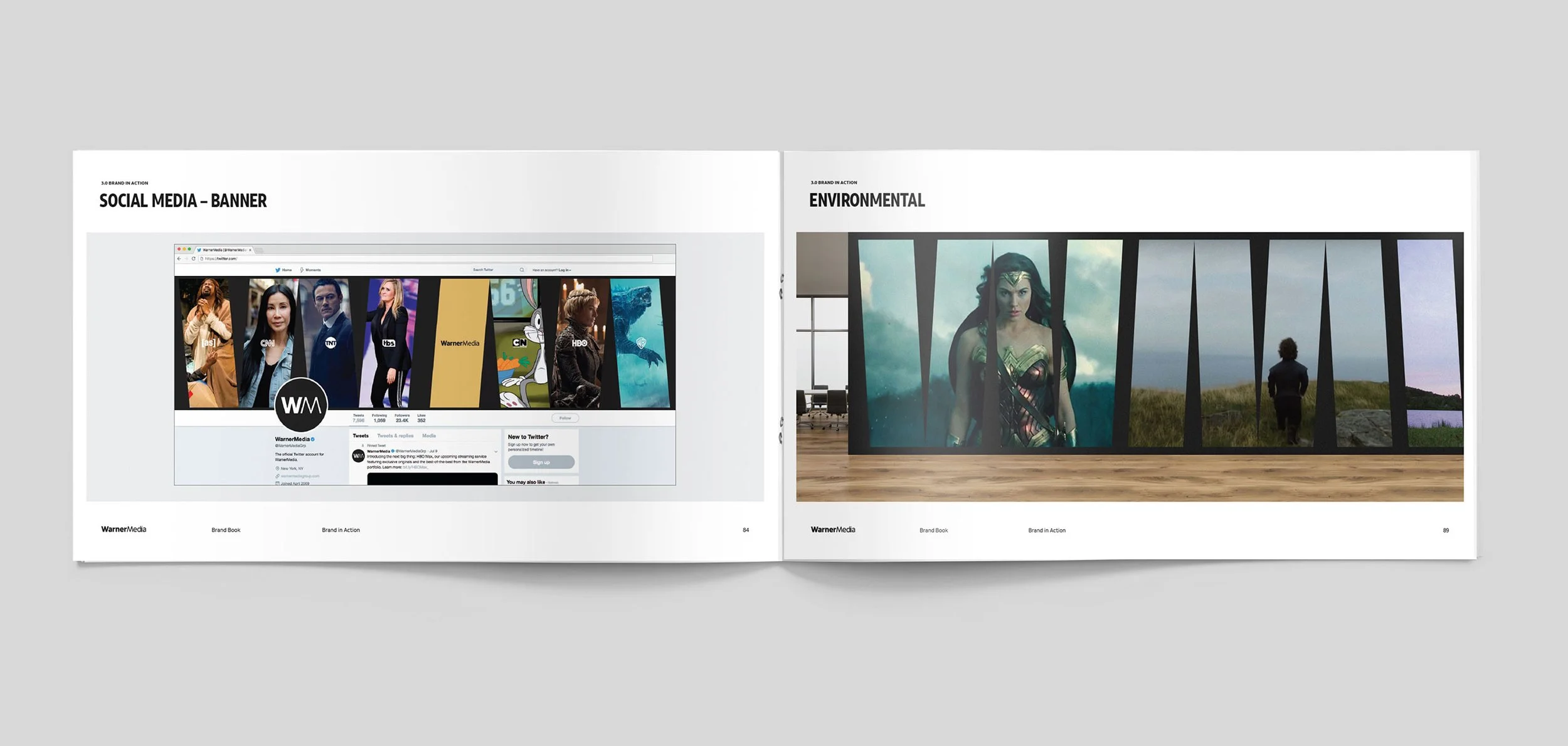
Brand Outlines outlining visual elements of the new identity including logo usage, color palette, typography, imagery, and tone of voice ensuring consistency and cohesion across all touchpoints.
Logo, watermark, and a graphic system
Brand assets: business cards, letterheads, emails signatures, social media templates, & advertising materials.


LESSONS LEARNT
Redesigning WarnerMedia's brand identity offered valuable insights:
Understanding brand values & audience is crucial for a design that reflects the core identity.
Involving stakeholders ensures the final design meets the needs of executives, employees, and customers.
Testing & refining multiple design concepts lead to a more effective and visually appealing result.
Employing a flexible design system ensures consistency across different applications.
Thoughtful planning is necessary for an effective rollout across all channels. By applying these lessons, they can create impactful brand identities that resonate with their audience and support their objectives.
THE DESIGN PROCESS
The WarnerMedia brand identity redesign was a complex and collaborative process involving the company's internal design team and external agency Pentagram. The goal was to create a modern identity reflecting the company's shift towards innovative entertainment. Extensive research and analysis were conducted, leading to multiple design concepts presented for stakeholder feedback. After refinement and testing, a final design featuring a bold blue wordmark and adaptable graphic system was chosen. The new design was successfully implemented across WarnerMedia's properties and received positive reception for its cohesive and contemporary appearance.